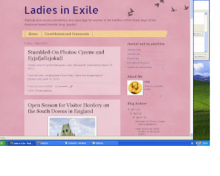
Apologies to the reader (if any) who is artistically offended by the current experiments with this blog's layout. The use of pink is trite but it is timely, at least, since the website looks like an Easter egg.
It could be worse,
as indicated by this earlier incarnation:
!
Suggestions on technical improvements are most welcome.

No comments:
Post a Comment